AVAILABLE WITH BUSINESS SUBSCRIPTION

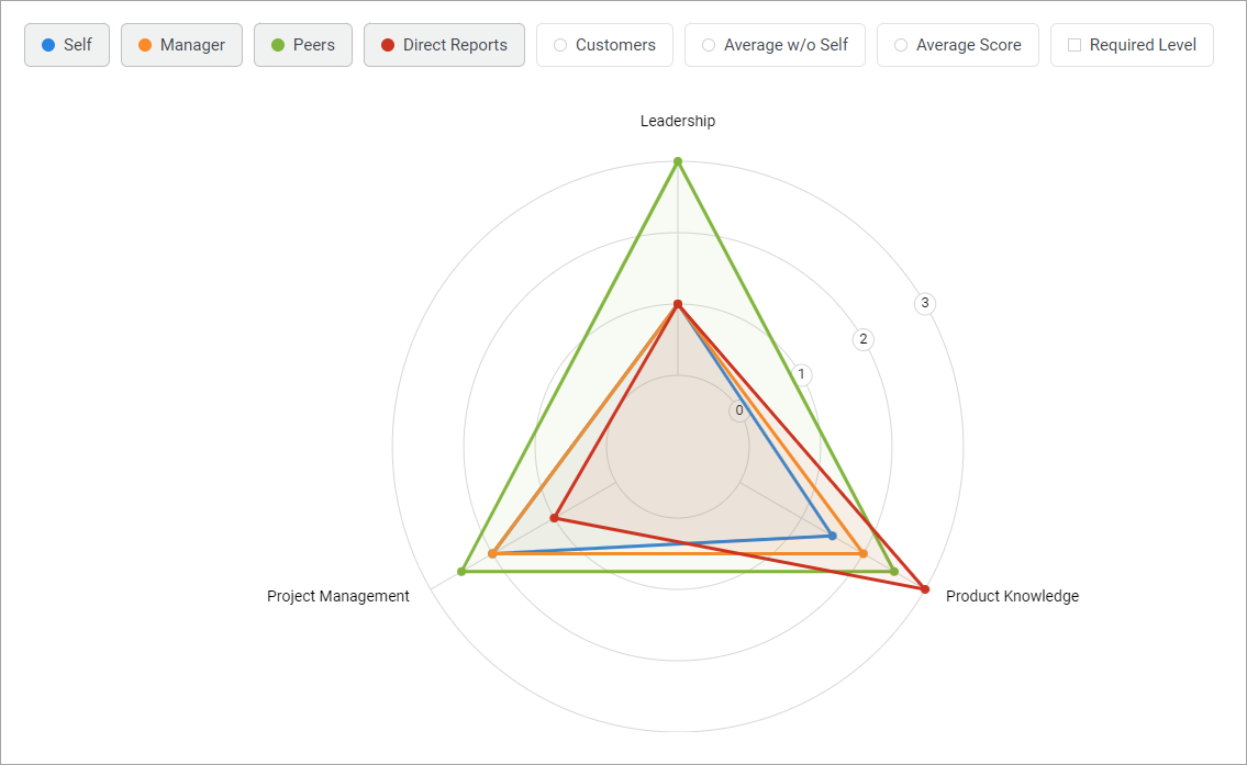
The Competency Radar Chart is an interactive diagram that shows scores given by each reviewer group across all competencies.

The chart is designed as a colored pie chart.

  • The circles represent the different levels of the rating scales. Levels start from the smallest circle.
  • The axes of a circle represent competencies.
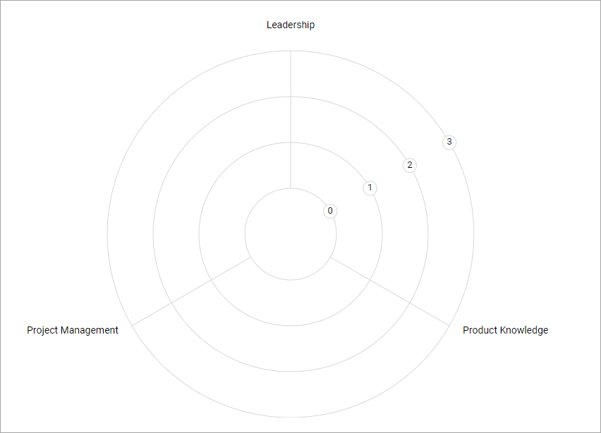

  • Dots on the axes are competency scores from a specific group of reviewers. 
  • The dots are connected by a colored lineThe line shows all scores given by one group.
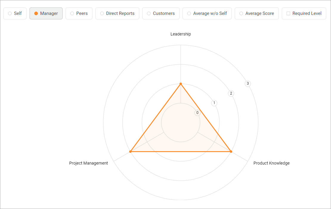
  • Each group has its own color.

The radar chart shows the following groups:

  • Self
  • Manager
  • Peers
  • Direct Reports
  • Average Score
  • Required Level
  • Average w/o Self
  • Average Score

Interactivity

When you hover over the dots, a tooltip will appear with the name of the competency and the score that was given by the group.

Filters

All groups are enabled by default. You can customize which information to show in the chart.

For example, let's compare the average score of an employee with the required level. To do this, disable all groups except the Required Level and Average Score.

Indicator Scores

If a competency is divided into indicators, the chart will show the score for each indicator. To do this, click on the competency name or on the score.