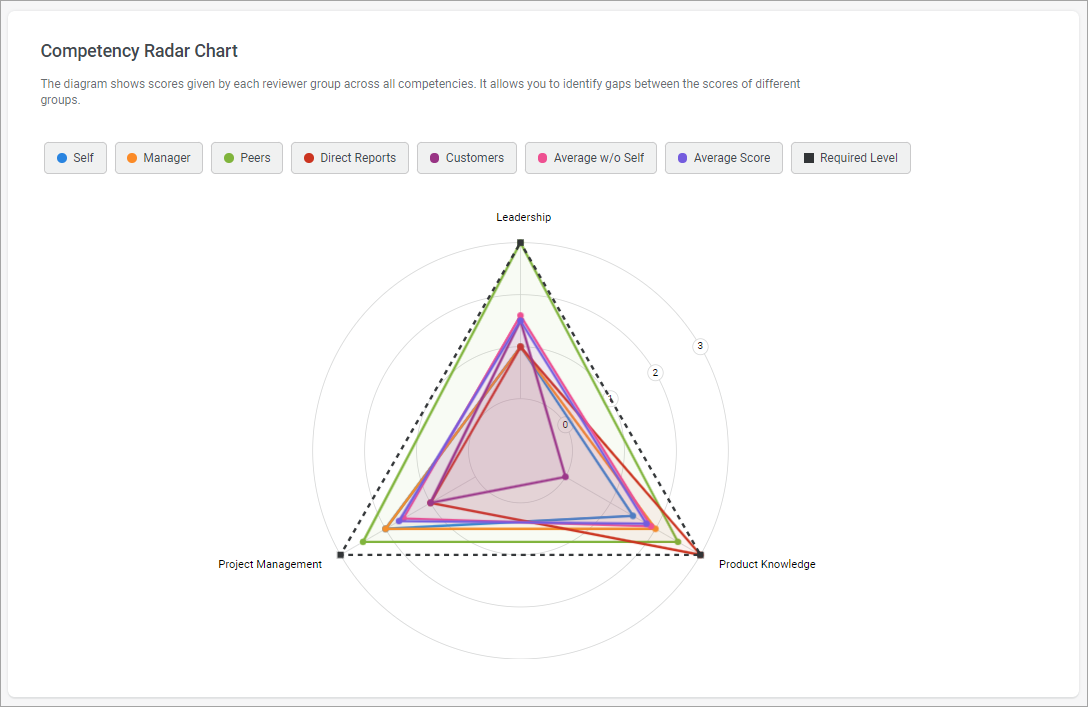
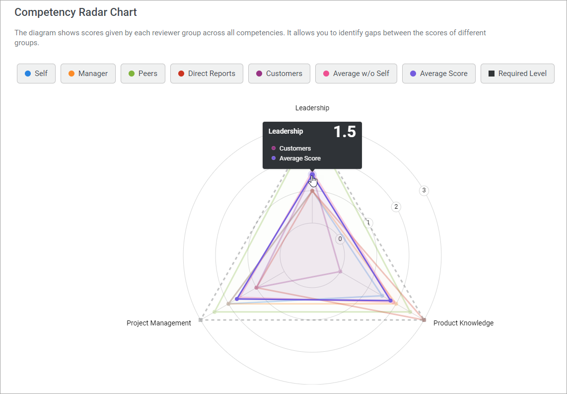
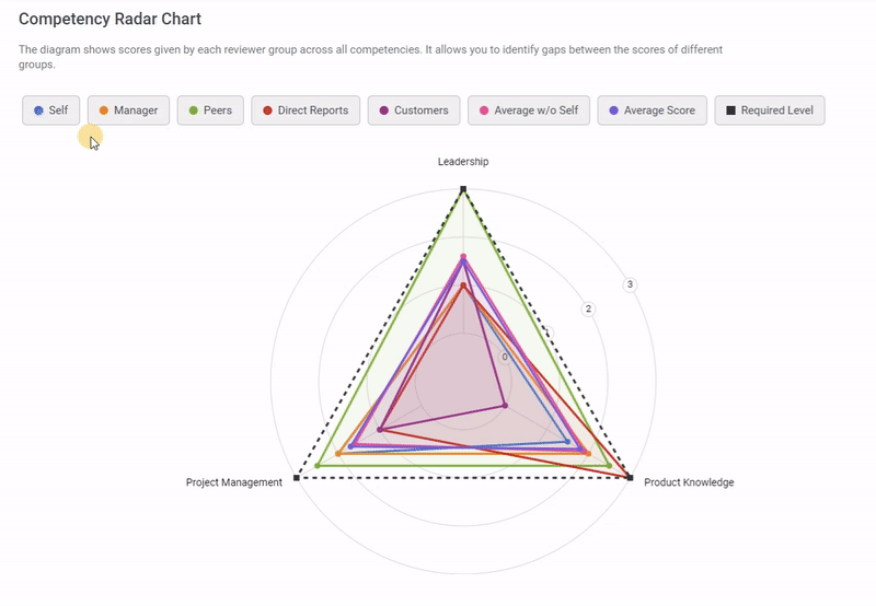
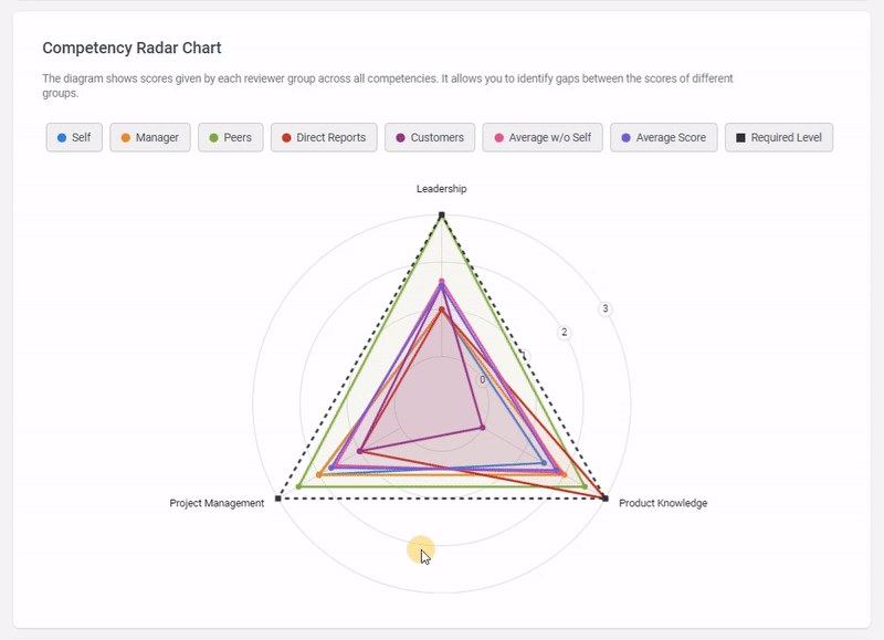
The chart is designed as a colored pie chart.
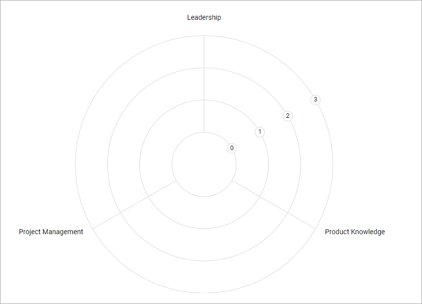
- The circles represent the different levels of the rating scales. Levels start from the smallest circle.
- The axes of a circle represent competencies.
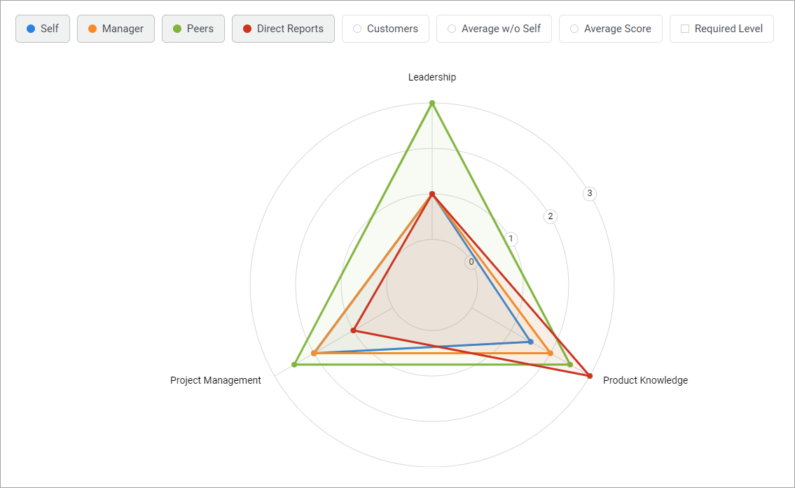
- Dots on the axes are competency scores from a specific group of reviewers.
- The dots are connected by a colored line. The line shows all scores given by one group.
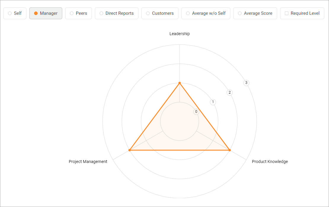
- Each group has its own color.
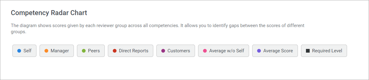
The radar chart shows the following groups:
- Self
- Manager
- Peers
- Direct Reports
- Average Score
- Required Level
- Average w/o Self
- Average Score